Re-Evaluating the Efficiency of Physical Visualizations: A Simple Multiverse Analysis
Abstract
A previous study has shown that moving 3D data visualizations to the physical world can improve users' efficiency at information retrieval tasks. Here, we re-analyze a subset of the experimental data using a multiverse analysis approach. Results from this multiverse analysis are presented as explorable explanations, and can be interactively explored in this paper. The study's findings appear to be robust to choices in statistical analysis.
Author Keywords
Physical visualization; multiverse analysis.
ACM Classification Keywords
H5.2 User Interfaces: Evaluation/Methodology
General Terms
Human Factors; Design; Experimentation; Measurement.
Introduction
Whereas traditional visualizations map data to pixels or ink, physical visualizations (or "data physicalizations") map data to physical form. While physical visualizations are compelling as an art form, it is unclear whether they can help users carry out actual information visualization tasks.
Five years ago, a study was published comparing physical to on-screen visualizations in their ability to support basic information retrieval tasks
These results however only hold for the particular data analysis that was conducted. A group of statisticians and methodologists recently argued that results from a single analysis can be unreliable
Study
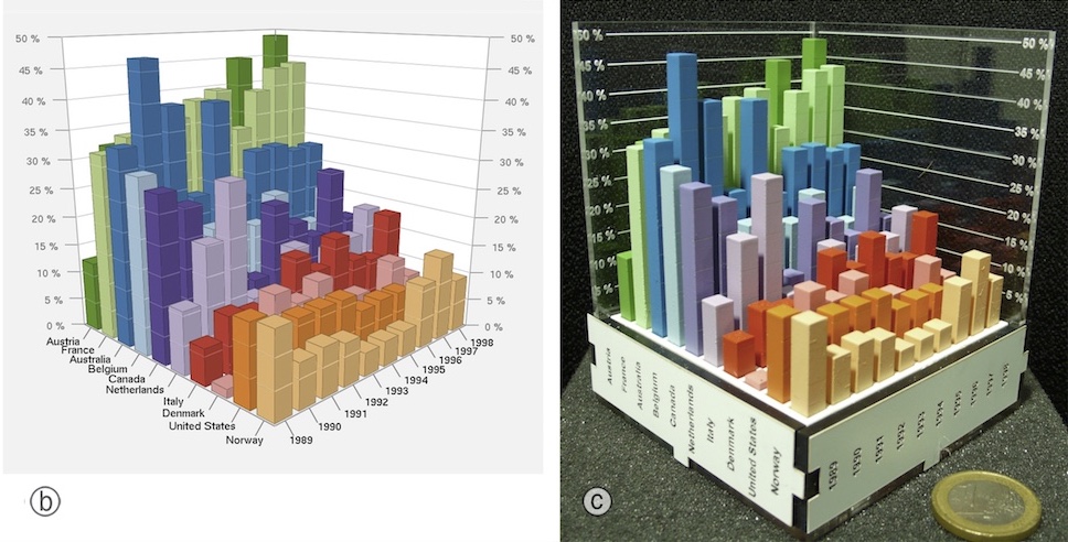
The study consisted of two experiments. In the first experiment, participants were presented with 3D bar charts showing country indicator data, and were asked simple questions about the data. The 3D bar charts were presented both on a screen and in physical form (see Figure 1). The on-screen bar chart could be rotated in all directions with the mouse. Both a regular and a stereoscopic display were tested. An interactive 2D bar chart was also used as a control condition. Accuracy was high across all conditions, but average completion time was lower with physical 3D bar charts than with on-screen 3D bar charts.
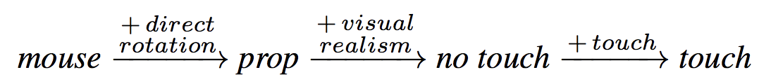
Here we only re-analyze the second experiment, whose goal was to better understand why physical visualizations appear to be superior. The experiment involved an “enhanced” version of the on-screen 3D chart and an “impoverished” version of the physical 3D chart. The enhanced on-screen chart was rotated using a 3D-tracked tangible prop instead of a mouse. The impoverished physical chart consisted of the same physical object but participants were instructed not to use their fingers for marking. There were 4 conditions:
- physical touch: physical 3D bar charts where touch was explicitly encouraged in the instructions.
- physical no touch: same charts as above except subjects were told not to use their fingers to mark points of interest (labels and bars).
- virtual prop: on-screen 3D bar charts with a tangible prop for controlling 3D rotation.
- virtual mouse: same charts as above, but 3D rotation was mouse-controlled.
These manipulations were meant to answer three questions: 1) how important is direct touch in the physical condition? 2) how important is rotation by direct manipulation? 3) how important is visual realism? Visual realism referred to the higher perceptual richness of physical objects compared to on-screen objects, especially concerning depth cues. Figure 2 summarizes the three effects of interest.
Sixteen participants were recruited, all of whom saw the four conditions in counterbalanced order. For more details about the experiment, please refer to
Results
Like the original paper we use an estimation approach, meaning that we report and interpret all results based on (unstandardized) effect sizes and their interval estimates
We focus our analysis on task completion times, reported in Figures 3 and 4. Dots indicate sample means, while error bars are
confidence intervals computed on
untransformed data
log-transformed data
Figure 3 shows the
mean
(geometric) mean
completion time for each condition. At first sight, physical touch appears to be faster than the other conditions.
However, since condition is a within-subject factor, it is preferable to examine within-subject differences
Figure 4 shows the pairwise
differences
ratios
between mean completion times. A value lower than
0
1
(i.e., on the left side of the dark line) means the condition on the left is faster than the condition on the right. The confidence intervals are
not corrected for multiplicity.
Bonferroni-corrected
Since the individual confidence level is ,
meaning they are effectively CIs
Figure 4 provides good evidence that i) physical touch is faster on average than physical no touch, and that ii) physical no touch is faster than virtual prop. This suggests that both visual realism (e.g., rich depth cues) and physical touch can facilitate basic information retrieval. Importantly, these two properties are unique to physical objects and are hard to faithfully reproduce in virtual setups. In contrast, we could not find evidence that physical object rotation (as opposed to mouse-operated rotation) provides a performance advantage for information retrieval.
Discussion and Conclusion
Our findings for experiment 2 are in line with the previously published study
Meanwhile, the use of bootstrap CIs makes the results slightly stronger, although this is likely because bootstrap CIs are slightly too liberal for small sample sizes
We did not re-analyze experiment 1 to keep this article simple. Since experiment 1 used four conditions and the reported analysis included a figure with seven comparisons
The goal of this article was to illustrate how the ideas of multiverse analysis